Client Washington Federal / Internal, HR Department
Project Founded over 100 years ago, Washington Federal is one of Seattle’s oldest banking institutions. Dedicated to their clients and the role that lending institutions play in a region, WAFD maintains a strong presence across the Northwest. The organization was facing an internal challenge in that their HR department needed an integrated visual brand strategy to help them deliver their messages and training tools. The challenge was to create a visual brand that was separate from but clearly related to the existing core, public visual brand already established by Washington Federal.
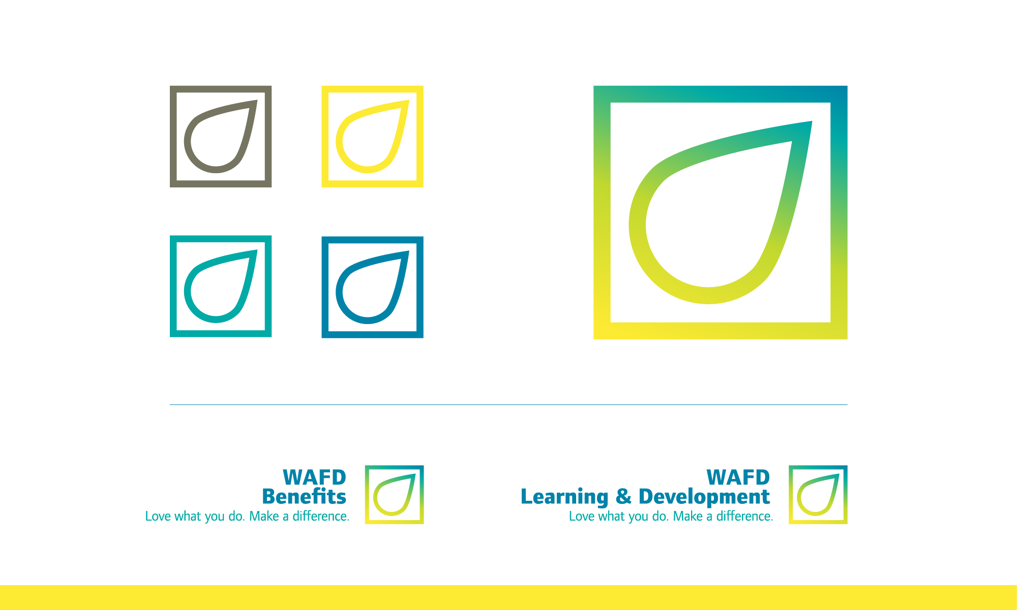
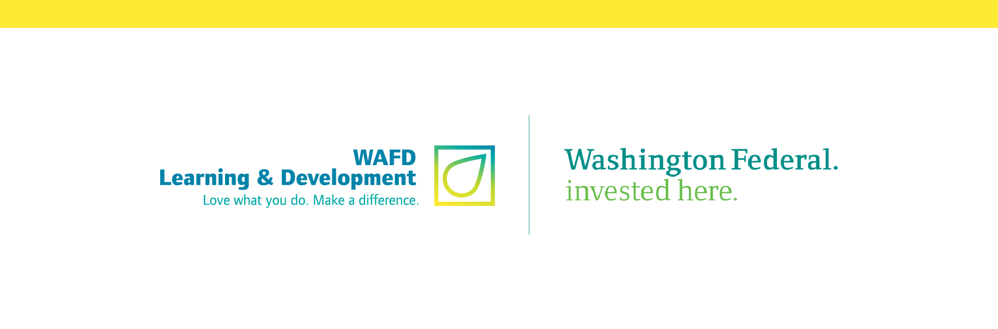
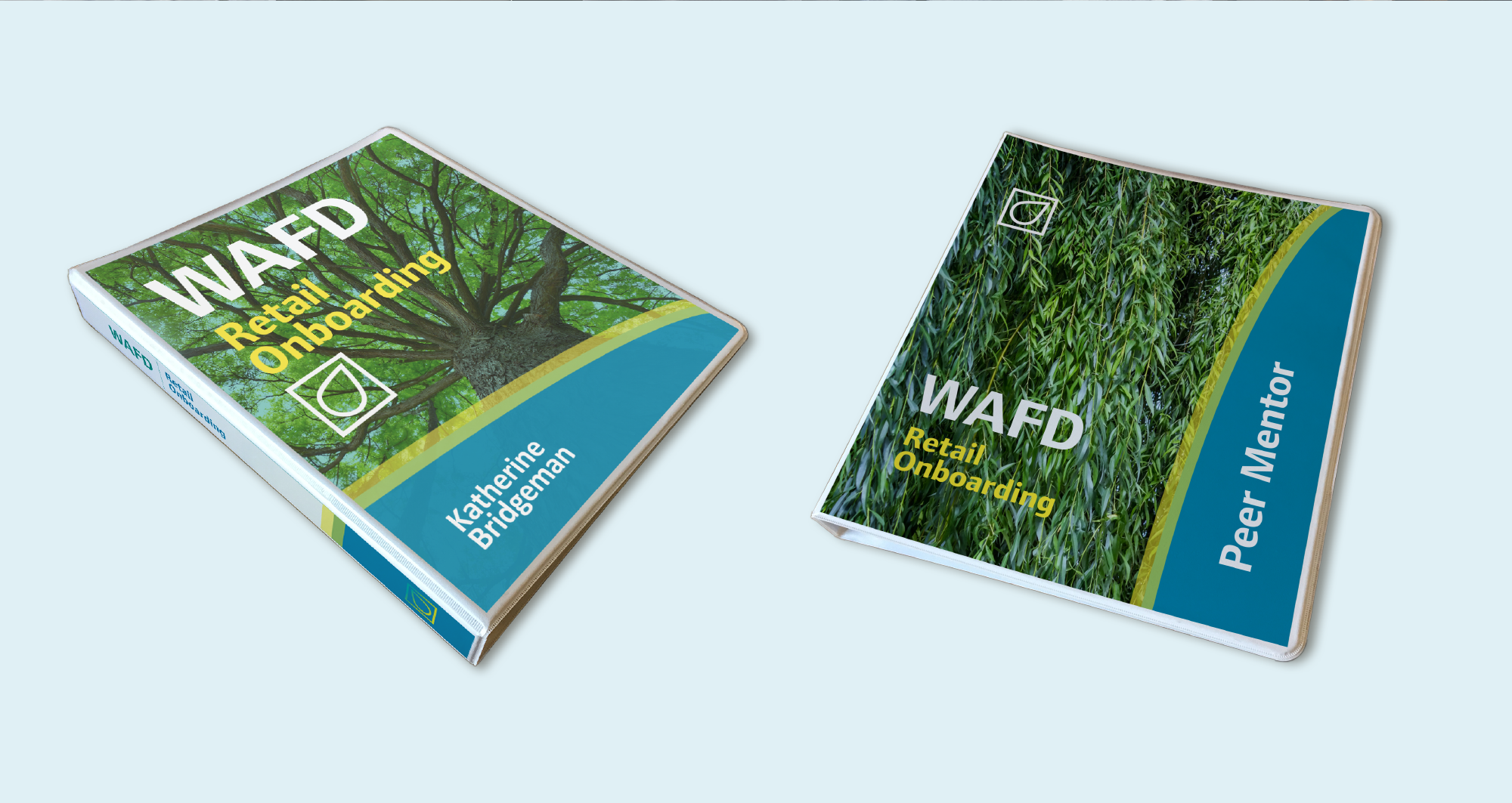
Our approach was to simply reshuffle the existing brand elements to highlight certain aspects while downplaying others. For example, the color palette is the same, however we introduced a gradient and emphasized the blue and yellow rather than the green. The primary typeface is simply the sans serif version of the standard, corporate one. We also decided to use the shortened, familiar WAFD in the lock-up rather than the full institution name.
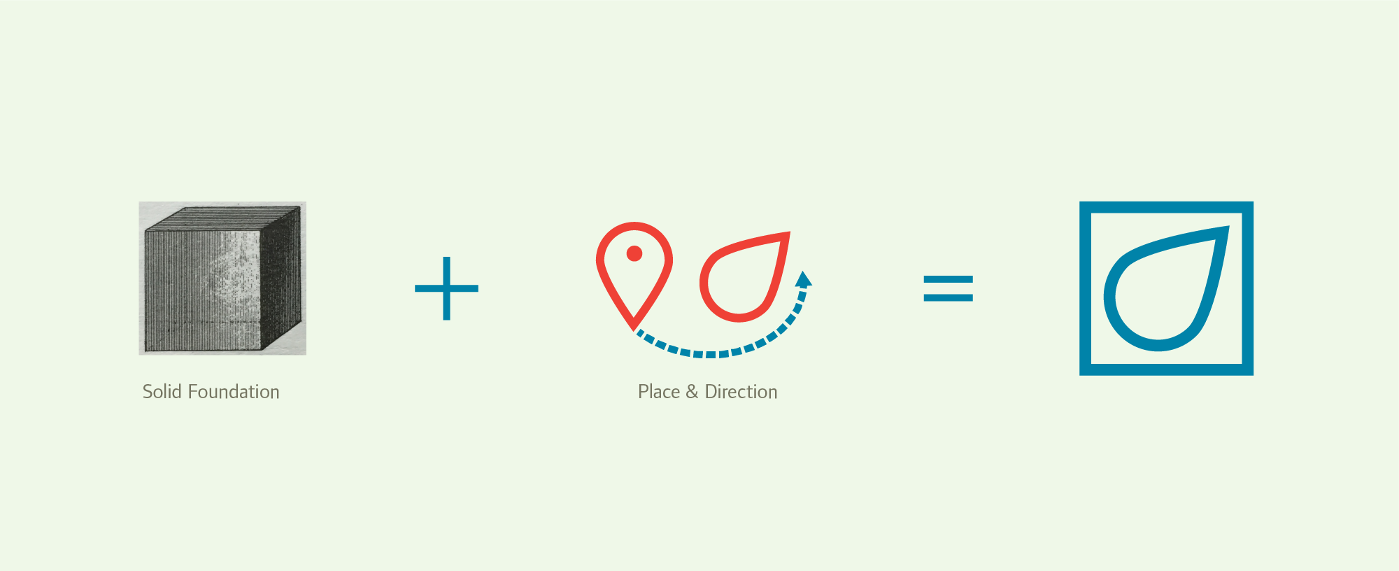
The only wholesale, new creation is the logo mark which is comprised of a square combined with a modified “place” icon. The square indicates stability and structure; characteristics of any good Human Resources department. The rotated “pace” Icon represents both a “you are here” concept as well as an expression of growth, mobility and future. Again, another important factor of a committed HR department.
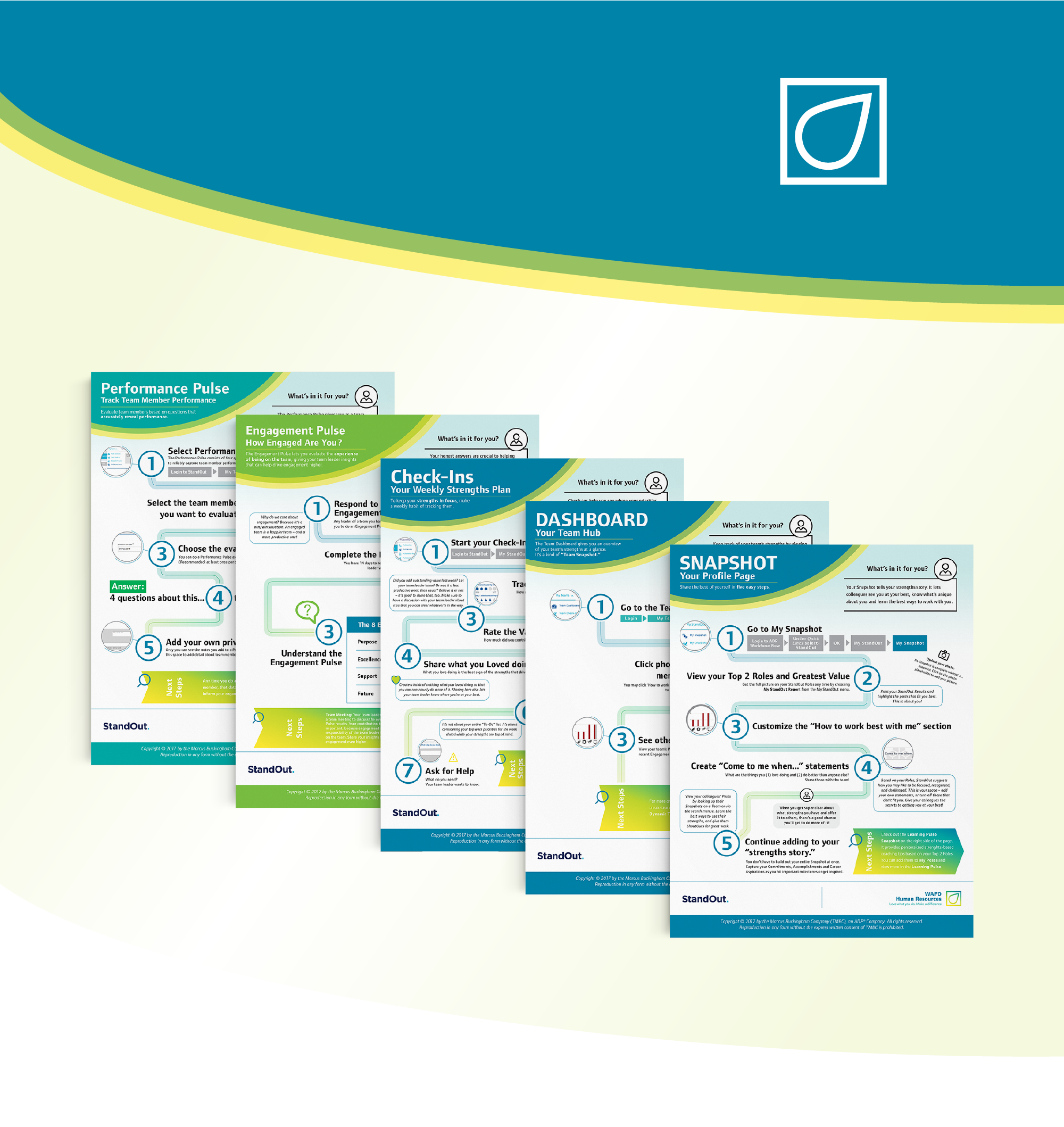
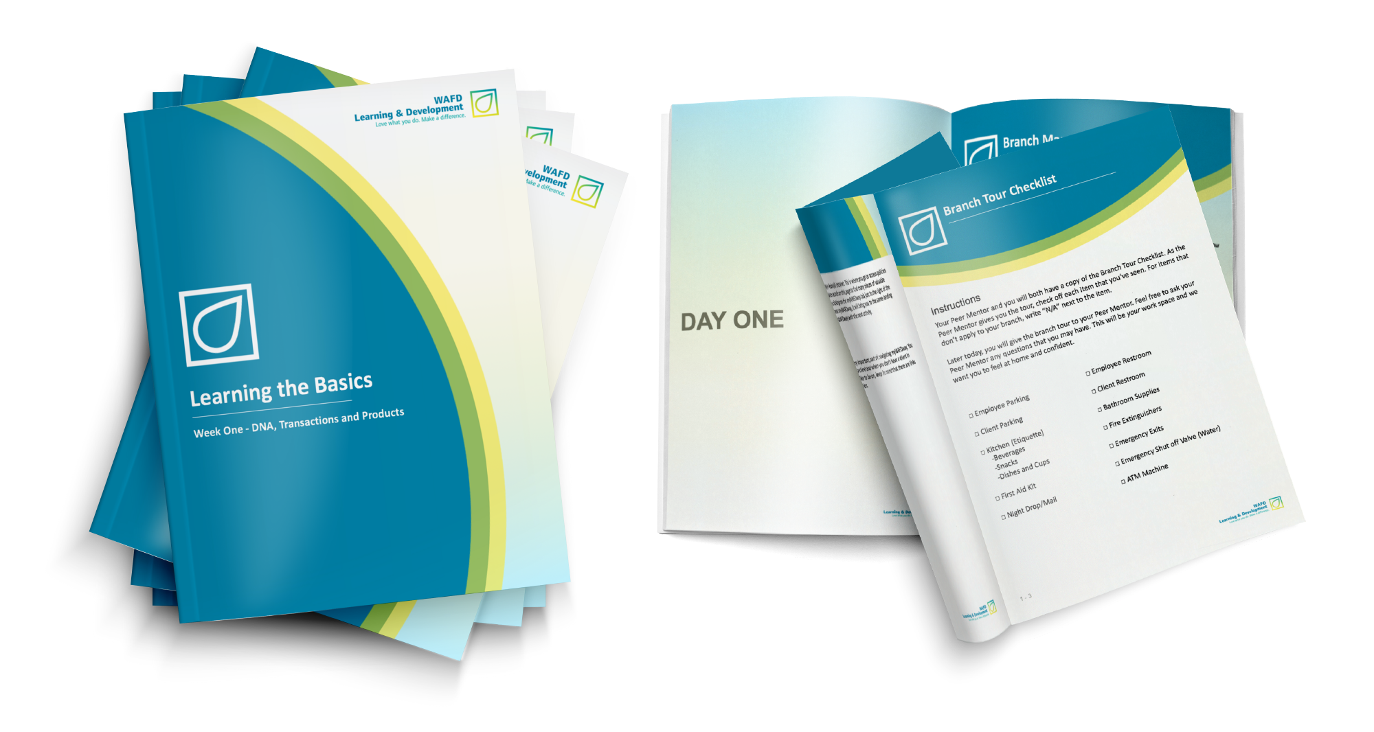
Below is some of the work and collateral we've created so far.
Product Visual Identity for HR Department, infographics, workbooks, Power Point Template